Ray Ban
This case study delves into the comprehensive redesign of the Ray-Ban Stories mobile launch website, focusing on a human-centered approach that aimed to enhance user experience, streamline decision-making, and create a seamless interaction between users and the brand.
Ray Ban
This case study delves into the comprehensive redesign of the Ray-Ban Stories mobile launch website, focusing on a human-centered approach that aimed to enhance user experience, streamline decision-making, and create a seamless interaction between users and the brand.
Ray Ban
This case study delves into the comprehensive redesign of the Ray-Ban Stories mobile launch website, focusing on a human-centered approach that aimed to enhance user experience, streamline decision-making, and create a seamless interaction between users and the brand.
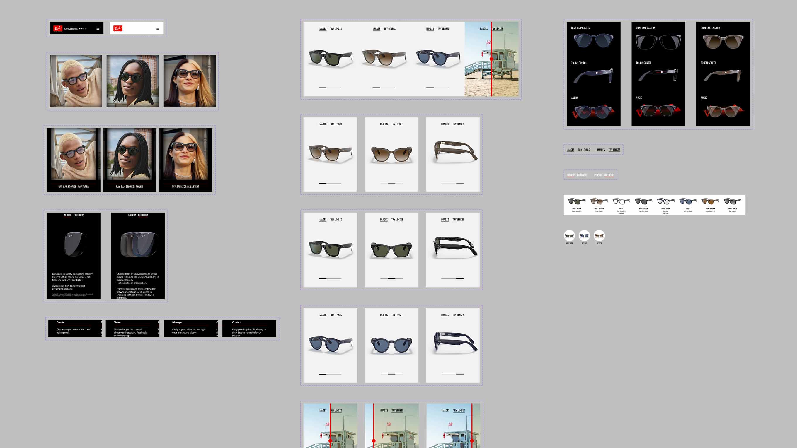
The existing website suffered from excessive visual clutter, including parallax scroll effects, animations, and auto-playing videos. During Ray-Ban's user testing, it was observed that customers seldom navigated to the end of the launch page. Instead, they preferred to visit the store page, built in Ray-Ban's established design language, for product information.
The existing website suffered from excessive visual clutter, including parallax scroll effects, animations, and auto-playing videos. During Ray-Ban's user testing, it was observed that customers seldom navigated to the end of the launch page. Instead, they preferred to visit the store page, built in Ray-Ban's established design language, for product information.

METHODOLOGY
Observation and Empathy
The project commenced with a thorough process of user testing and observation. This step enabled the team to place themselves in the shoes of the users and gain valuable insights into their preferences, pain points, and expectations. These insights were segmented into user profiles, each highlighting specific needs and challenges.
Defining User-Centric Solutions
The next phase involved transforming these insights into actionable questions using the "How Might We...?" framework. This approach generated a range of potential solutions to address the identified user needs. By framing challenges as opportunities, our team fostered a creative environment conducive to innovative problem-solving.
Worst Possible Solutions
To further refine the proposed solutions, our project team explored the concept of worst possible solutions. This unconventional approach shed light on what not to pursue, eliminating potential pitfalls and providing a clearer path toward effective design choices. This process encouraged critical thinking and guided our team away from ineffective or counterproductive solutions.
Optimal Solution Implementation
Armed with a refined set of solutions, our project team embarked on the process of translating ideas into wireframes and then final designs. This phase involved collaborative efforts between team members and Marco Catani, Luxottica Optimization and UX Research Director to hone the final design into a proposal that his team could use. Iterative design cycles ensured that the final product aligned seamlessly with the user-centric principles established earlier in the project.
Figma Prototype - Click to start, Hit 'R' to restart
Figma Prototype - Click to start, Hit 'R' to restart
RESULTS
The redesigned Ray-Ban Stories website showcased a remarkable transformation that resonated with users on multiple levels: Enhanced User Experience By placing user needs at the forefront, the new design facilitated a more intuitive and engaging browsing experience. Visitors could effortlessly navigate through the website, access information, and explore product offerings without having to filter through unnecessary animation and parallax scrolling effects. Streamlined Decision-Making The human-centered design approach minimized decision fatigue by presenting relevant information in a clear and concise manner. By prioritizing type hierarchy and utilizing white space to separate blocks of information, users could now easily compare products, features, and pricing, empowering them to make informed choices. Strengthened Brand Engagement The revamped website fostered a stronger emotional connection between users and the Ray-Ban brand. The new landing page feels closer to the experience seamless interface, coupled with compelling visuals and relatable content, deepened user engagement and brand loyalty.